

Reimagining a Nautical Coffee Logo
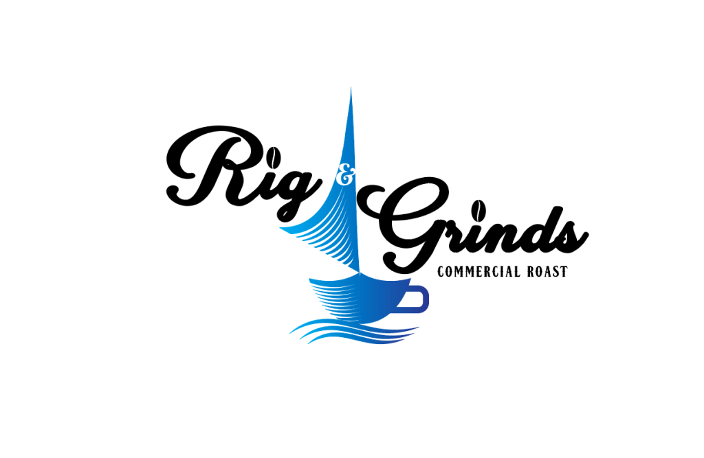
A post-crowdsourced logo rebrand: A tale as old as time. Owner of Rig & Grinds, Brett came to me to rebrand his logo after seeing my work for Wild. From what I understand, they used a crowdsourcing design website to have a logo designed, and it just wasn’t what they wanted. Still committed to the idea behind their original logo, Brett reached out to see if I could reimagine the idea, but you know, better.
Rig & Grinds is a coffee roasting company located in Santa Rosa, Florida. It was always Brett’s dream to create something that combined his two loves: coffee and the ocean. An avid sailor, he created Rig & Grinds—a nautical themed coffee company. Santa Rosa is a tourist hot spot on the Gulf Coast in Florida, so a nautical themed coffee roaster was welcomed with open arms by tourists and locals alike. As an ocean and coffee lover myself, I was excited to take on this challenge of reimagining their brand.
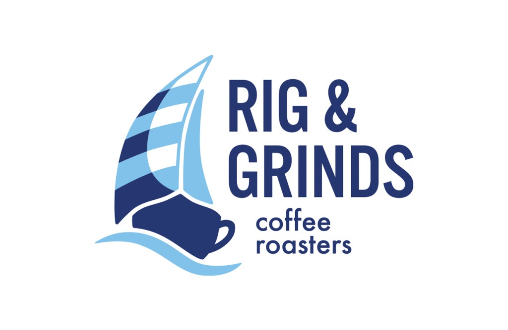
Over a dozen sketches, two rounds of edits, and several typography studies later, we found the perfect combination of logomark and type. Keeping the same cool tones and much of the same visual motifs, I upgraded the sail and type to better reflect the company they have created. I even threw in a secondary logo for horizontal uses.
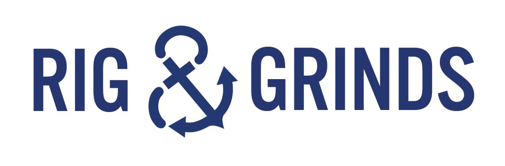
Knowing that the new logo is very square in nature, I also wanted to equip Brett with a secondary horizontal logo that could be used for areas that were more long and thin—the handle of a coffee cup, for instance. This secondary logo featured the same typeface paired with an anchor-ampersand to complete the nautical vibe.
Brett says that his new brand is even better than how he originally imagined it in his head. Finally his logo and brand matches the high quality coffee he roasts.
